1 on 1 Best Tile Color Combinations : A Guide to Adore Your Space
Tiles are more than functional—they are a statement of style, personality, and design. At Barson Ceramic LLP, we know the power of choosing the right tile colors. A thoughtful tile color combinations can completely transform any room, adding depth, harmony, and character.
Whether you’re creating a bold kitchen backsplash, a tranquil bathroom, or a sophisticated living area, selecting the right tile colors can feel overwhelming. But don’t worry! This guide will simplify the process and help you find best tile color combinations that match your taste and needs.
Let’s explore the exciting world of tile color combinations
Table of Contents
Why tile color combination are so important
Tiles influence the overall vibe of a space. Their colors can make a room feel warm, bright, spacious, or dramatic. They also set the tone for other design elements like furniture and decor.
Here’s how tile color combination impact a space:
- Light colors reflect more light, making small spaces feel bigger.
- Dark tiles create a cozy, intimate atmosphere.
- Bright or bold hues bring energy and creativity.
- Neutral tones offer timeless elegance.
By carefully choosing your tile palette, you can create the perfect mood for any room in your home.
Popular Floor Tile Color Combinations
Let’s explore some classic and modern tile color combinations that are sure to inspire:
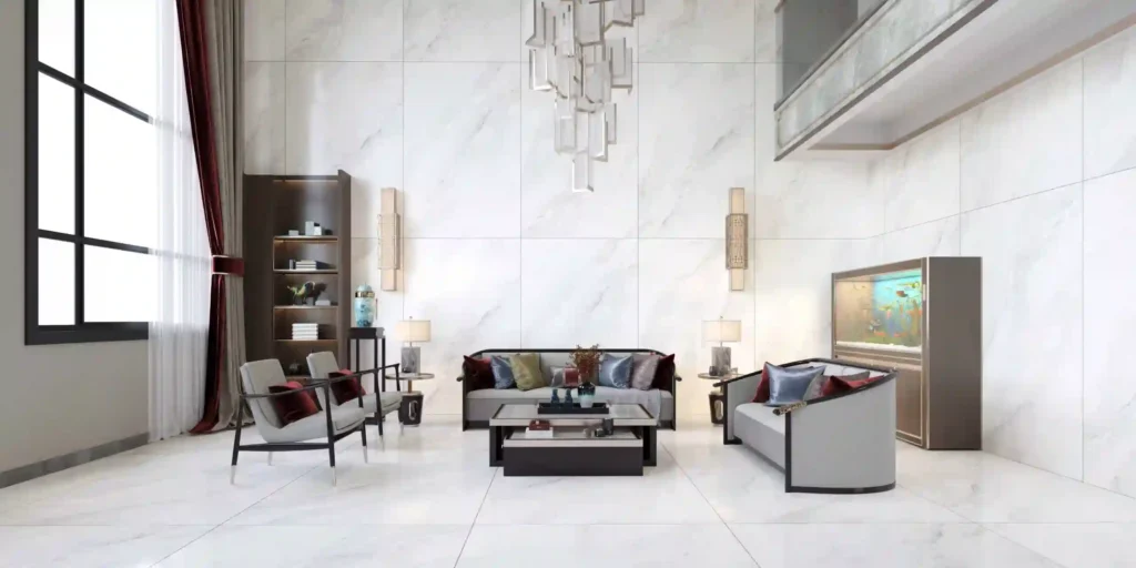
1. Black and White
This timeless duo suits nearly any space. Black and white tiles add contrast and create a clean, sophisticated look.
2. Grey and White
Perfect for minimalist and contemporary interiors, this pairing feels calm and understated.
3. Blue and Beige
Soft blue tiles with beige accents evoke a coastal or Mediterranean feel. They are perfect for bathrooms and kitchens.
4. Green and Brown
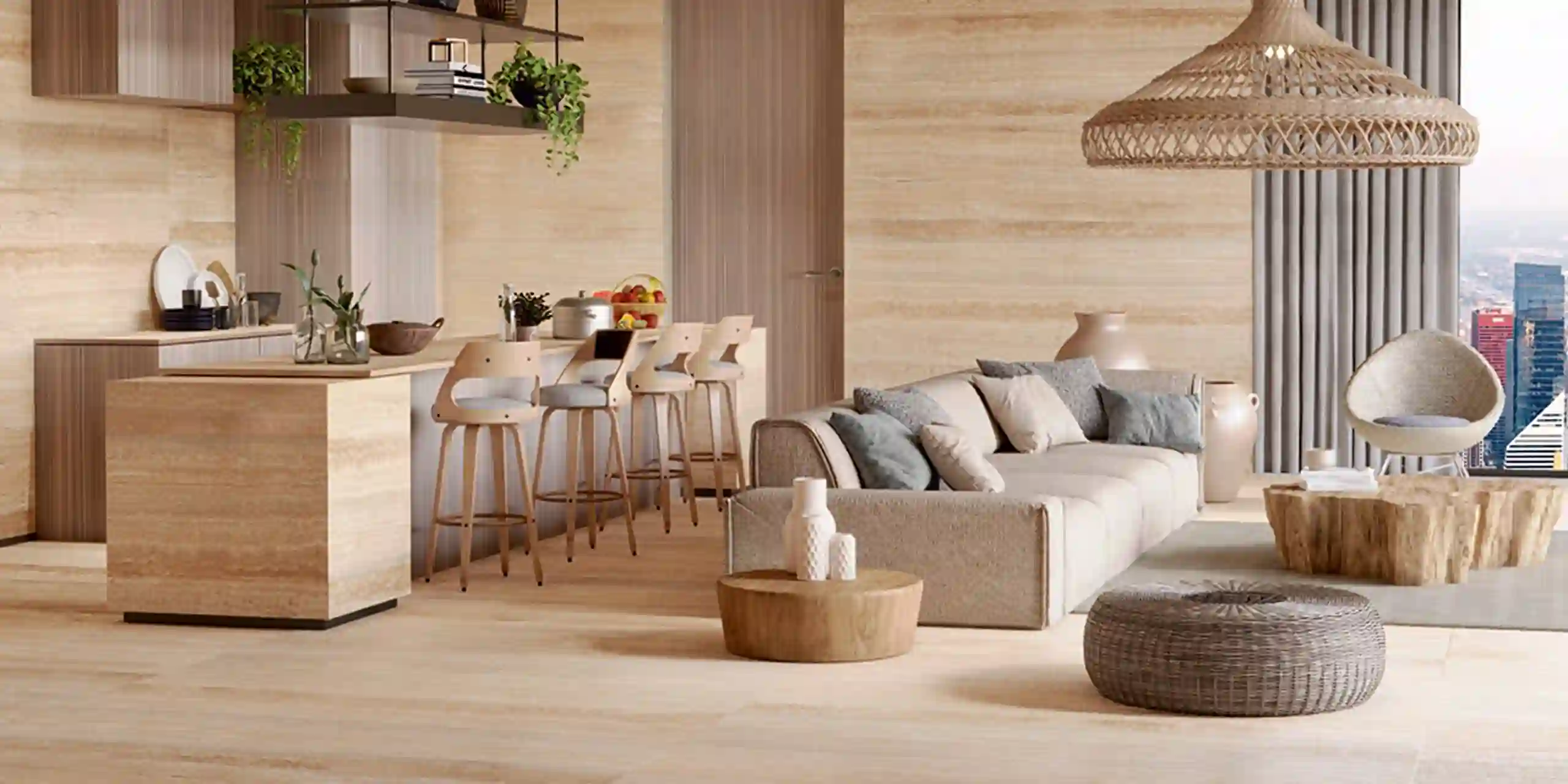
Earthy tones like olive green and mocha brown create a warm, natural look. This combination is great for outdoor spaces or rustic interiors.
5. Terracotta and Cream
Terracotta tiles bring warmth and charm, while cream tones balance the richness. Ideal for living rooms or patios.
Modern Tile Color Trends
1. Monochromatic Themes
Using one color in various shades creates depth without overwhelming the eye. For example, pair pale grey tiles with charcoal accents for a chic look.
2. Bold Colors with Neutrals
Bright tiles like teal or mustard paired with neutral tones make a statement while maintaining balance.
3. Metallic Accents
Gold, silver, or copper tiles add luxury and sophistication. They’re perfect as accents in kitchens or bathrooms.
4. Pastel Hues
Soft pastels like mint green or blush pink are becoming popular in modern designs. They create a gentle, soothing ambiance.
Choosing Tile Color combination for Different Spaces
Each room in your home has unique needs. Let’s break it down room by room:
Bathrooms
- Fresh Look: Use white tiles with pastel accents for a spa-like vibe.
- Modern Feel: Grey and black tiles bring sleekness and style.
Kitchens
- Classic Choice: Subway tiles in white paired with dark grout for a clean and timeless appeal.
- Rustic Style: Beige and olive tones evoke warmth and comfort.
Living Rooms
- Inviting Vibes: Terracotta and cream create a cozy, welcoming atmosphere.
- Elegant Look: Black and white tiles add drama and sophistication.
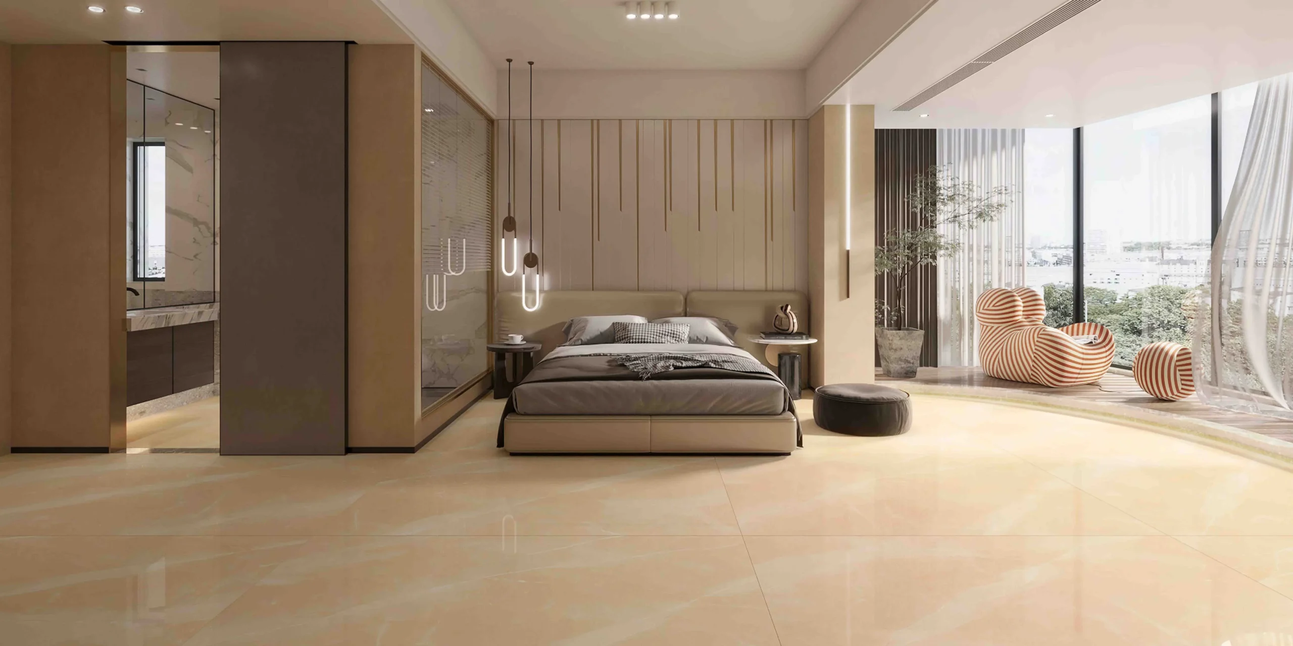
Bedrooms
- Relaxing Ambiance: Neutral shades like beige and white are ideal for bedrooms.
- Subtle Pop: Light grey with pastel accents keeps things calm yet interesting.
Outdoor Spaces
- Natural Touch: Earthy tones like green and brown blend beautifully with the outdoors.
- Bold Contrast: Dark grey tiles paired with white create a striking effect for patios.
Tips for Picking the Right Tile Colors
Here are some practical tips to help you choose wisely:
1. Start with a Mood Board
Collect images of tiles, furniture, and paint colors that inspire you. This will give you a clear direction.
2. Test Tile Samples
Always get samples and view them in your space. Lighting can change how colors look.
3. Follow the 60-30-10 Rule
Use this design principle for balance:
- 60% of the dominant color (floor or wall tiles).
- 30% of a secondary color (accent tiles).
- 10% of a bold or contrasting color.
4. Coordinate with Your Decor
Tiles should complement your furniture, cabinets, and decor. For example, warm wood furniture pairs well with beige or terracotta tiles.
5. Mix Textures
Combine glossy and matte finishes for added interest. For instance, glossy wall tiles with matte floor tiles.
6.Keep Maintenance in Mind
Light tiles may show dirt more easily, while dark tiles can hide imperfections. Choose what works for your lifestyle.
Mistakes to Avoid
1. Overusing Bold Colors
Too many bright colors can overwhelm the space. Stick to a balanced palette.
2. Ignoring Grout Colors
Grout can either enhance or ruin the look of your tiles. Use complementary grout shades for a polished finish. and more about tile spacing information you can visit TILE SPACING GUIDE by clicling it..
3. Choosing Trend-Only Designs
Trendy colors are fun, but timeless designs ensure long-term satisfaction.
4. Neglecting the Lighting
Always consider how natural and artificial light affects the tile colors in your space.
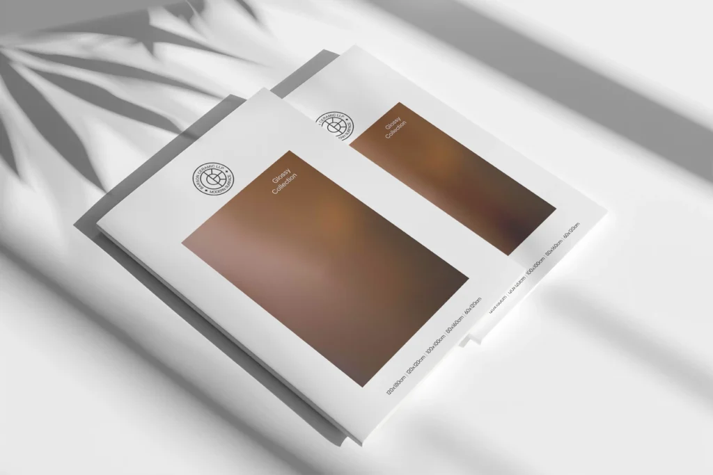
Why Choose Barson Ceramic LLP?
At Barson Ceramic LLP, we are passionate about helping you create the home of your dreams. We offer a wide variety of high-quality tiles in stunning colors, textures, and finishes.
{ for dark and light tones / tili color combinations we have special collection for easy to choose please contact on [email protected] or at +91 84880 66433 }
Why Our Customers Love Us:
- Extensive Range: From timeless classics to trendy designs, we’ve got it all.
- Unmatched Quality: Our tiles are durable, easy to maintain, and built to last.
- Expert Guidance: Our team is here to help you choose the perfect tiles for your space.
Frequently Asked Questions (FAQs)
Q: How do I clean and maintain light-colored tiles?
A: Regular cleaning with mild soap and water keeps them looking fresh.
Q: Can I mix patterns with solid tiles?
A: Yes, but use patterns sparingly to maintain balance and avoid a busy look.
Q: Are dark tiles harder to clean?
A: Not necessarily. Dark tiles often hide dirt and stains better than light ones.
Q: Should I match tile colors with my furniture?
A: Yes, coordinating tile colors with furniture creates a cohesive and harmonious design.
Final Thoughts
Choosing the perfect tile color combination is an art, but it doesn’t have to be daunting. By following these tips and exploring various combinations, you can create a space that reflects your style and enhances your home’s beauty.
At Barson Ceramic LLP, we’re here to make your design journey enjoyable and rewarding. Explore our wide collection of tiles and bring your vision to life.